seL4
Using UX research to redesign seL4’s website and make it accessible for an ever-growing and ever-changing audience.
About seL4
seL4 is a member of the L4 microkernel family, and is the world's most advanced, most highly assured operating-system kernel. A microkernel is the minimal core of an operating system (OS). It presents a very small subset of what is generally considered an operating system today.
Its comprehensive formal verification doesn’t compromise performance, and it is used by businesses as a trustworthy foundation for building safety and security-critical systems. It is available as open source on GitHub and supported by the seL4 Foundation.


The challenge
sel4’s website and document centre site provided information to a highly expert audience. However, as the popularity of sel4’s services increased, its audience broadened, as less technically orientated people wanted to learn more about sel4’s advanced operating system. In essence, the need for information has diversified and the importance of easy-to-find information at various levels of technicality increased.
When sel4 came to Reading Room, its website was built with a strong content and function focus, but less attention given to the aesthetics and page layouts. Reading Room was challenged to conduct UX research and redesign a website that looked modern and attractive, but was also functional, where highly technical content was accessible for everyone.
Our approach
Given the complexity of sel4’s user/customer base, finding the right balance of technicality vs granularity of the website content was a key challenge to overcome.
1. Workshops & user research
Our team planned collaboration workshops with the client to explore their objectives and possible barriers, as well as exploring sel4’s user groups and personas. Based on the initial findings, we crafted a well-planned email survey to gather direct users’ impressions of the current experience and their needs and frustrations.
Based on these initial insights, we were able to start working on the best way to construct the new website for the best possible content search functionality for their highly technical users’ groups.


2. UX design & branding
In a parallel action, we ran a card sorting exercise to explore the users' mental models and intuitive approach to group their contents into clear and user-defined categories. After several sessions with sel4, we came up with the final information architecture for this website that contained highly technical yet digestible content.
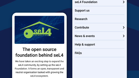
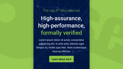
As part of our website design service, we defined a visual style that used a combination of photography and more illustrative type images to represent key concepts of the brand. An icon family was also decided upon to illustrate services and key points.
A design system was created that was aesthetically pleasing as well as functional. Allowing for content to be clearly presented and signposted on a page as well as allowing layouts to be flexible and easily adaptable. Slight tweaks and additions were made to the seL4 branding to make colours accessible and to allow more visual interest in designs.
The outcomes
Our collaborative plan worked perfectly from research to design. We overcame the main challenge of working with highly cryptic content and managed to deliver on a tight deadline, with a great redesign and a solid UX strategy, with information architecture to improve the user experience as the client required.
By simplifying the process of searching, finding and navigating sel4’s highly complex and technical content, the website met the needs of sel4’s target audiences. Both current users looking for detailed information and new users who need more information to learn about the product.
Mulling over a digital challenge?
We're here to help you transform ideas into impactful solutions. Let’s explore new approaches and uncover the right strategies to bring your vision to life.